As hundred year old properties are being renovated all around Kansas City, one of the biggest decision points is whether to keep the roots of the original charm and style of the home or update it to a modern vibe. Ultimately, I decided that one couldn't have complete disregard for the origins of the building. So vintage inspired paint colors became the goal.
I started researching pictures of historic Hyde Park in Kansas City, and (duh) - they were all in black and white, so that didn't get me very far. Further research turned up this conclusion- at the turn of the century, paint companies offered a very limited number of colors, mainly variations of earth tones such as sage, salmon, forest green, cadmium blue, plus off-white tones.
Sherwin Williams has now released a collection of America's Heritage Palette - Exterior Color Schemes. The palettes shown on their website feature a rather neutral color scheme, maintaining the era of the classics. My goal was to add a little excitement to these traditional schemes.
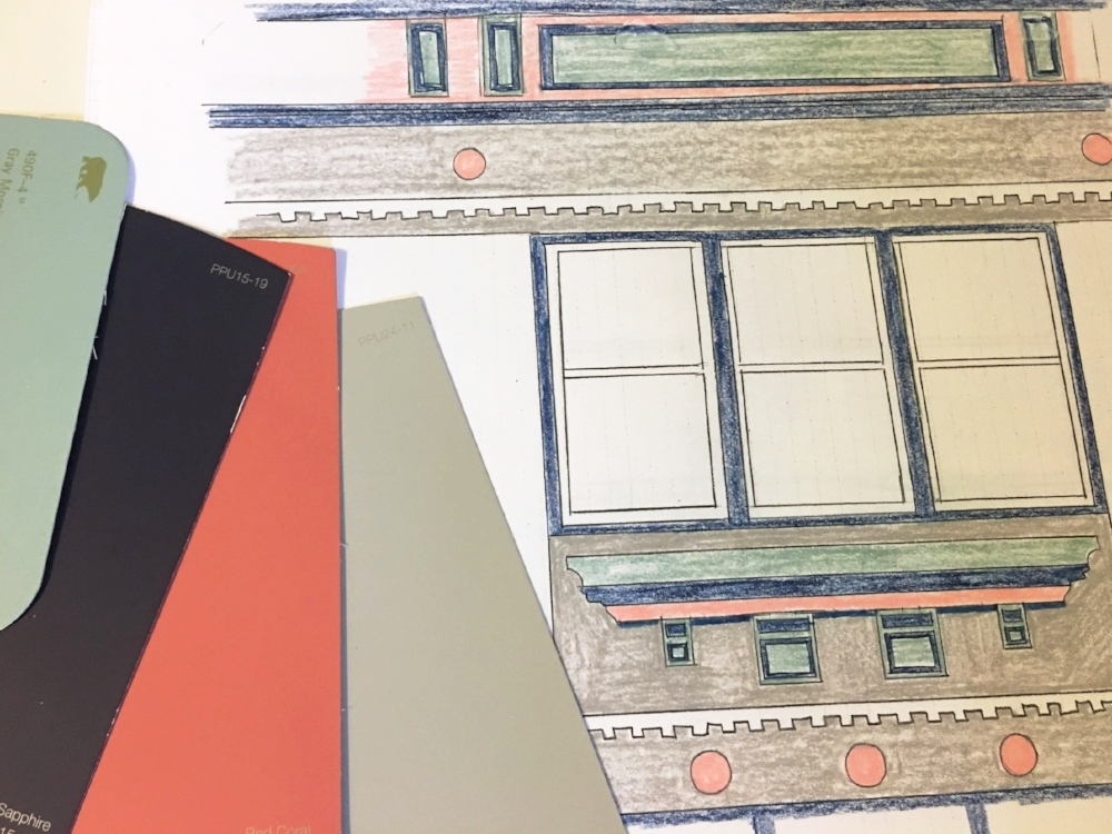
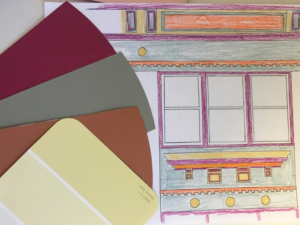
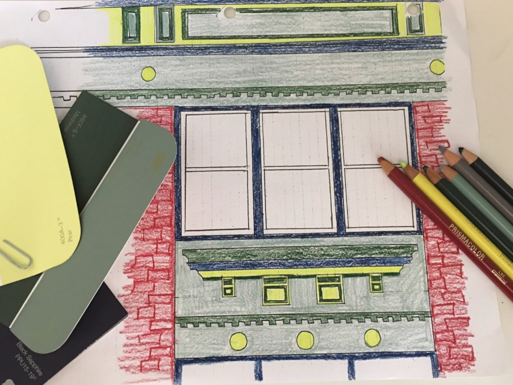
I began the process of choosing colors through doing sketches of the intricate woodwork, the picking paint color palettes that I loved and coloring them to look at how the contrast would make the molding POP! A few of my ideas are shown below.
Ultimately, my favorite color scheme was the one on the far right - navy blue, medium green, light green, and a citron yellow. After picking these colors, I went to purchase them at Sherwin Williams and found that the citron yellow that I had chosen easily fades in the sunlight - as do most of the yellows or light oranges. So, it caused a last minute switch my the contemporary citron color to a more traditional salmon shade.
Ultimately, the paint colors that we used from Sherwin Williams are::
- "Navy" - SW7605: Gale Force
- "Light Green" - SW0029: Acanthus
- "Medium Green" - SW6207: Retreat
- "Salmon" - SW6347: Chrysanthemum
Before: Bright, mismatched, and seemingly randomly picked colors.
After: Vintage, refreshing, clean, and consistent.


